∞
∞
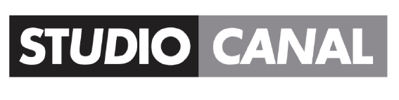
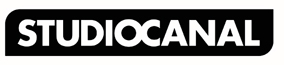
logo for STUDIOCANAL
STUDIOCANAL is a subsidiary of the CANAL+ Group. It is one of Europe’s leading companies in the market for co-production, acquisition, distribution and sale of international feature films. STUDIOCANAL is the only studio operating simultaneously in three main territories across Europe: France, the United Kingdom and Germany. Each subsidiaries, including Optimum Releasing, had its own name and logo design. There was a need for one consistent name and logo to work across all European markets.
The company distributes a total of more than 50 films a year throughout Europe, and owns one of the most important libraries in the world, with more than 5,000 international titles.
The old STUDIOCANAL logo featured the name written in bold white capital letters on a black and grey block background with a few random letters italicised. The solution was to tidy up and make the typography more consistent using a single weight of the Canal+ master typeface. The two words are literally joined together to form one, and positioned in a custom Canal+ rectangle with dynamic asymmetric rounded corners.